
Working with CSS Grid

1. What is a grid?
A network of lines that cross each other to form a series of squares or rectangles.
2. What is CSS grid?
CSS Grid is a powerful tool that allows for 2-dimensional layouts to be created on the web. It is a 2-dimensional system, meaning it can handel layout in row and columns.
3. Basic terminologies.
1. Container :- A section or a division in which we want to work CSS grid(or rows and columns). We create a div container by setting the CSS display property to grid. ex.
 .container{display:grid;
}
2. grid-template-columns :- A CSS property to specify number of columns and their width. The width can be any no negative CSS length value like fr, %, px, em, etc. The best practice is to use fr(fraction) for responsiveness. We can use grid-template-rows too for specifing rows but in this blog we are going to use the column approach.
We do this by setting CSS property of our container as grid-template-columns to the width values.
ex.
 .container{
        display:grid;
     grid-template-columns: 1fr 3fr 1fr
 }
3. grid-area :- This property is used to specify the location and size of an item inside the container.
We specify a name for every items to use inside our grid-template-area (We will learn this next.) We set the property grid-area with a name to each items we want to use inside our container. In this exapmle we have 5 items as Navigation-Bar ,Main, Left-Side-Item, Right-Side-Item and Footer. We give all of them a name as
.navbar{grid-area:navbar}
4. grid-template-areas :- The last and most important step is to specify our layout in term of rows and columns, and we do this by using grid-template-areas inside our container as
.container{

display:grid;
grid-template-columns:1fr 3fr 1fr;
grid-template-areas:"navbar navbar navbar"
            "leftSide main rightSide"
            "footer footer footer";
}
Note : We use the name specified grid-area inside our grid template area.
We use Media Queries to change the layout on diffrent screen sizes by changing the grid-template-areas.
Implementation
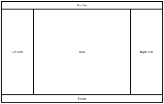
We are going to implement a simple 5 component layout as
Desktop View
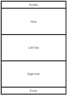
Mobile View
Step 0 :- Basic Html
    <div class="container">
     <div class="navbar">
         NavBar
    </div>

        <div class="main">
        Main
    </div>

        <div class="leftSide">
        Left  Side
    </div>

        <div class="rightSide">
         Right Side
    </div>

        <div class="footer">
        Footer
    </div>
     </div>
Step 1 :- CSS
/*Creating grid-template-columns and grid-template-areas*/

.container{

    display: grid;

    grid-template-columns:1fr 3fr 1fr ;

    grid-template-areas:"navbar navbar navbar"

                        "leftSide main rightSide"

                        "footer footer footer";

    }

/*specifing grid-areas*/
.navbar{ grid-area: navbar; }

.main{ grid-area: main; }

.leftSide{ grid-area: leftSide; }

.rightSide{ grid-area: rightSide; }

.footer{ grid-area: footer; }
This is it for our desktop view but for our mobile view let's add media query
@media only screen and (max-width: 600px)
 {

 .container{

    grid-template-columns:1fr;

    grid-template-areas:"navbar"

                        "main"

                        "leftSide"

                        "rightSide"

                        "footer";

 }
In this article we have had a very quick look through the Grid Layout Specification. Have a play with the code.
We would like to grow our readership. Can you help us out by sharing this blog post?

Written by Kundan Chandel